Do not index
Navigating UX design in AI products
AI UX is still very new.
When designing, it’s very normal to struggle with the user flows, structure the user interface, and how the system will function holistically.
There are 3 common reason why:
- Lack of understanding
- Lack of experience
- Lack of approach
Lack of understanding
You need more context of the system, holistically, before diving into design.
Try doing (more) stakeholder interviews with the following team members:
- Product Managers
- Engineers
- Customer Success
The goal is surface business case and logic, tech constraints, and customer pain points.
The more you speak to your counterparts, the better context of the space you have.
Lack of experience
You might have very limited experience in designing of AI products, using AI products, or industry knowledge.
Here’s 3 thing you can immediately do:
- Find common AI workflows with Teardown AI
- Find common UX patterns with Mobbin
- Find a competitor and signup for their product
The goal is to rapidly gain an understand on how other designers solve the same problem by doing an audit of their UX then UI.
Lack of approach
You may want to dive straight into higher fidelity mocks to show stakeholders.
Please don’t.
Zoom out and map the whole system (at least the key use cases) before proceeding.
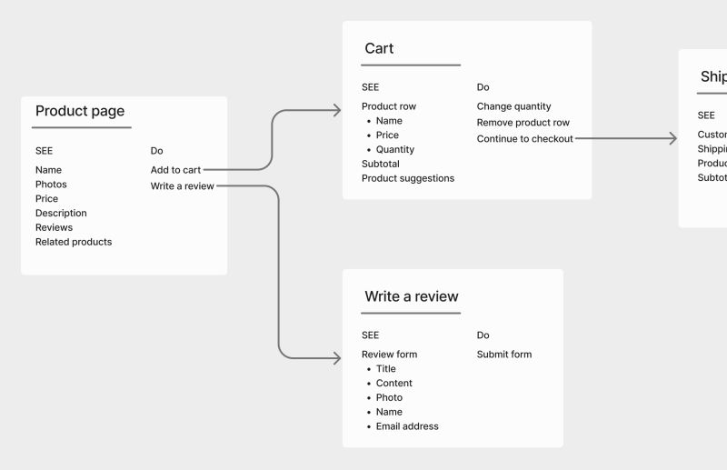
As you dive in and start working on specific features, use Dan Winer's See/Do approach (image below).
For every screen or component, list:
- What can the user see?
- What can the user do?
The goal is to understand the journey (visually) before designing screens.
This way you’ll get a more holistic view of the feature/product.

How designers can use Gen AI AMA with Lennart Nacke

More actionable tips and fewer headaches:
Join designers from 90+ countries using UX Playbook. Get detailed step-by-step guides and templates to supercharge your UX process.


