Table of Contents
- Accessibility and Inclusivity in UX Design
- How to design for accessibility with Maigen Thomas
- 1. Prioritise Keyboard Navigation
- 2. Embrace Sufficient Color Contrast
- 3. Make All Interactive Elements Accessible
- 4. Always Include ALT Text for Images
- 5. Ensure Your Animations are Non-Disruptive
- 6. Create Transcripts & Captions for Multimedia Content
- 7. Use Clear, Simple Language in Your UI Copy
- Key Takeaways
Do not index
Read time: under 4 minutes
Accessibility and Inclusivity in UX Design
When we talk about UX design, there’s a powerful, often overlooked layer: accessibility and inclusivity.
It's not just some 'nice-to-have' feature.
It’s about fundamentally rethinking how we connect with our diverse range of users.
In today’s blog, I’ll dive deeper into the must-have principles in every UX Designer playbook to craft inclusive and accessible designs for all users, regardless of their abilities or circumstances.
If you believe every user deserves a seamless, enjoyable digital experience, let’s dive in 👇
How to design for accessibility with Maigen Thomas

1. Prioritise Keyboard Navigation
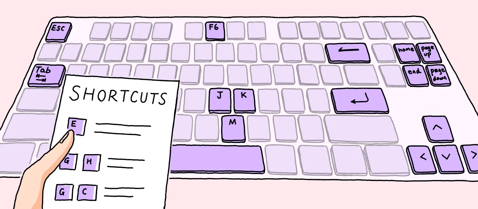
Consider this: not everyone has the ability to use a mouse.
This reality calls for designs that are fully navigable through keyboard commands:
Audit Existing Interfaces:
Regularly review your designs to ensure all functionalities are accessible via keyboard.
This includes navigation menus, forms, and interactive elements.
Logical Tab Order:
Ensure that tabbing through your website or application follows a logical order.
Making it intuitive for users relying on keyboards.
Visual Focus Indicators:
Implement clear visual cues to show where the focus is when navigating with a keyboard
Like highlighted buttons or menus.
2. Embrace Sufficient Color Contrast
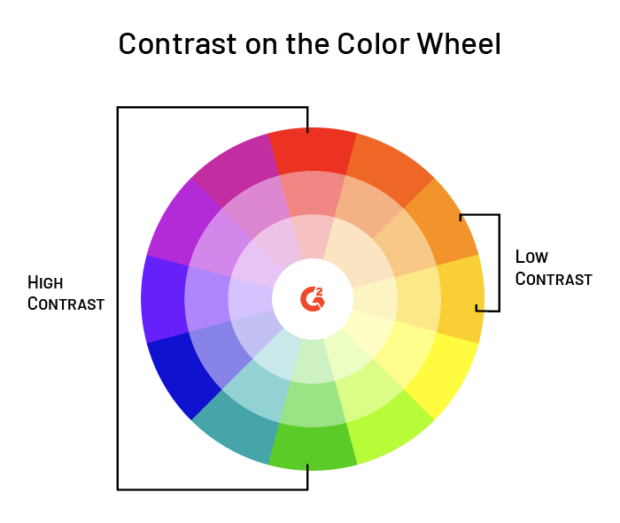
In design, colors do more than just please the eye; they convey meaning.
However, relying solely on colour can alienate users with visual impairments.
Here are some tips to make sure your colours palette is accessible for disabled users:
Use Contrast Tools:
Utilize tools like WebAIM's Contrast Checker to ensure text and important graphics stand out against background colours.
Avoid Coloru-Only Information:
Provide information using more than just colour (e.g., text labels or patterns) so it's accessible to colour-blind users.
Visual Focus Indicators:
Regularly test your designs with color-blindness simulators to understand how your design appears to users with different types of color vision deficiencies.
3. Make All Interactive Elements Accessible
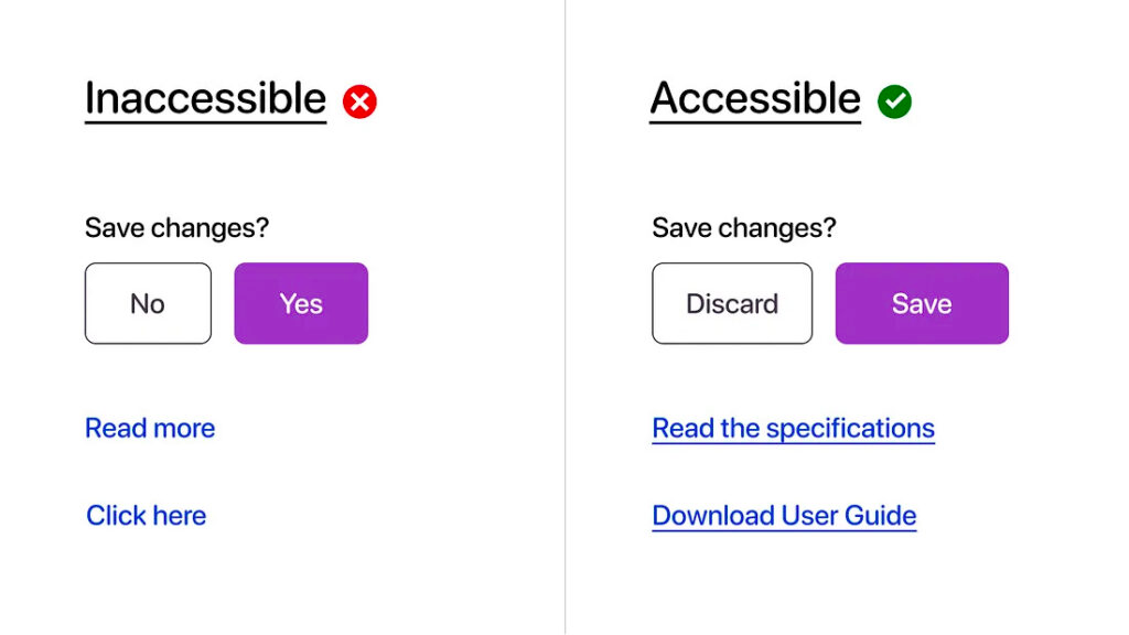
Accessibility isn't just about the big picture; it's in the details.
Interactive elements like buttons, links, and controls need to be screen-reader-friendly.
Accessible Buttons and Controls:
Ensure all buttons and controls are large enough to interact with and have clear labels.
Screen Reader Compatibility:
Use semantic HTML and ARIA (Accessible Rich Internet Applications) roles to ensure screen readers can interpret and read out your content correctly.
Feedback for Actions:
Provide auditory or visual feedback for interactions so users know when their actions are successful or need correction.
More actionable tips and fewer headaches:
Join designers from 90+ countries using UX Playbook. Get detailed step-by-step guides and templates to supercharge your UX process.


4. Always Include ALT Text for Images

A picture is worth a thousand words, but only if you can perceive it.
ALT text turns visual content into an inclusive experience.
Descriptive and Concise:
Write ALT text that’s descriptive yet concise.
It should convey the content and function of images.
Context Matters:
ALT text should be contextual.
For example, in an e-commerce site, product images should describe the product, not just say "image."
Don't Forget Icons:
Ensure that icons, especially those with actions (like a search magnifying glass), have descriptive ALT text.
5. Ensure Your Animations are Non-Disruptive
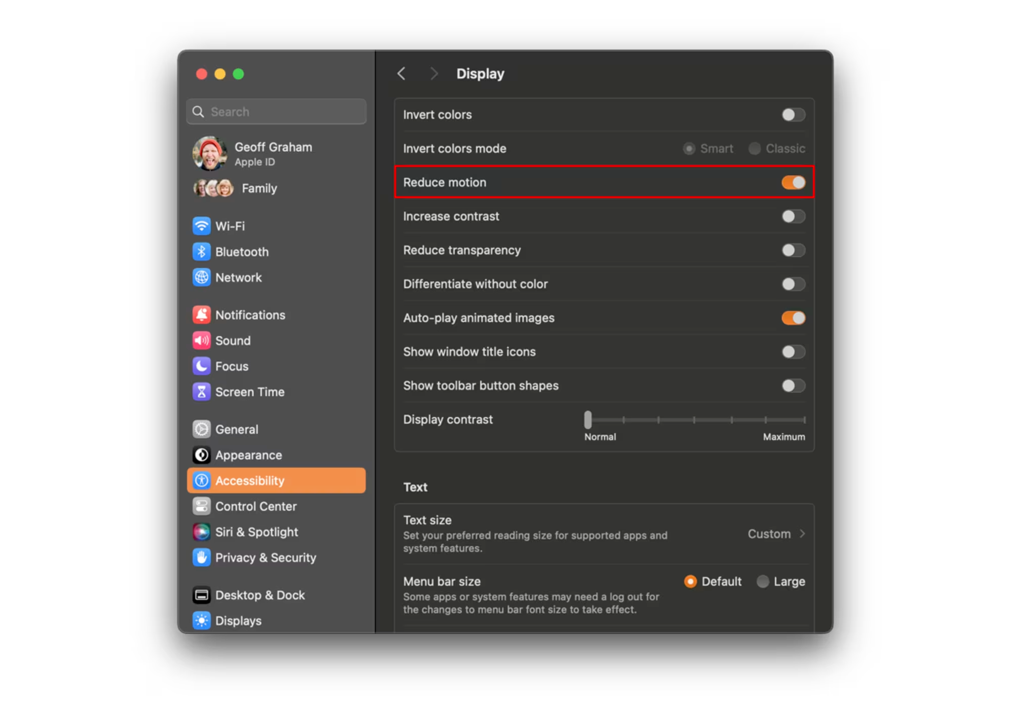
Animations can add life to your design, but they can also detract from it.
Elements that flash or move too quickly can be problematic for users with certain disabilities.
Preference Controls:
Provide options for users to reduce or turn off animations.
Avoid Flashing Elements:
Steer clear of elements that flash more than three times per second to avoid triggering seizures in susceptible individuals.
Test for Motion Sensitivity:
Regularly test your designs for motion sensitivity issues ensuring they are comfortable for all users, including those susceptible to motion sickness.
6. Create Transcripts & Captions for Multimedia Content
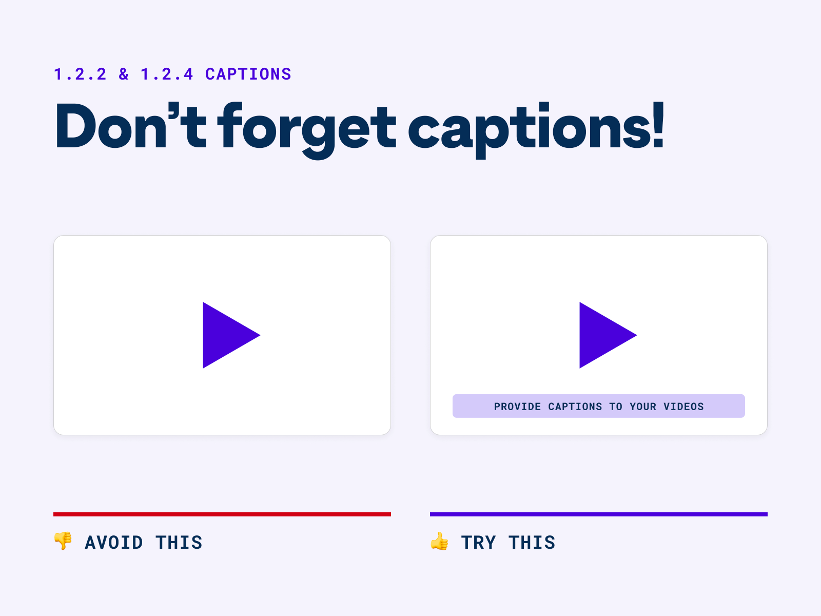
Multimedia isn't just for the seeing and hearing.
Transcripts and captions open up your content to:
- Those with hearing impairments
- Users in sound-sensitive environments.
Quality Captions:
Ensure captions are accurate, synchronous, and provide a full representation of the audio, including speaker identification and non-speech sounds.
Transcripts for Audio Content:
Provide transcripts for podcasts and audio messages, making sure they're easily accessible from the audio source.
Integrated Testing:
Regularly test your multimedia content with users who rely on captions and transcripts to ensure usability.
7. Use Clear, Simple Language in Your UI Copy
In the world of UX, clarity is king.
Jargon and complex sentences can alienate and confuse.
Plain Language:
Use plain language that’s easy to understand.
Avoid jargon and technical terms without clear explanations.
Consistent Terminology:
Use consistent terms and phrases across your application or website to avoid confusion.
User Testing:
Conduct user testing with diverse groups to ensure your language is understandable by people with various levels of reading proficiency and cognitive abilities.
Key Takeaways
7 key principles for accessible and inclusive UX Designs:
1. Prioritise Keyboard Navigation
2. Embrace Sufficient Color Contrast
3. Make All Interactive Elements Accessible
4. Always Include ALT Text for Images
5. Ensure Your Animations are Non-Disruptive
6. Create Transcripts & Captions for Multimedia Content
7. Use Clear, Simple Language in Your UI Copy
If you're reading this, take a moment to share this message.
Let's collectively commit to inclusive and accessible design.
By sharing these insights, we can spark a broader conversation and drive meaningful change in UX design.
Happy championing all users ❤️
Whenever you're ready, there are 4 ways I can help you:
1. Junior Designer Bundle: Transition to UX with the ultimate handbook (120+ videos, 80+ templates, 75+ examples) to craft an unforgettable portfolio & get hired.
2. Senior Designer Bundle: Become a design leader with systems to help you build a meaningful career & grow your designers. Join 500+ aspiring leaders.
3. UX Portfolio Critique: Get a 30-minute video review of your portfolio. A checklist of actionable things to fix, in less than 48 hours. Get a personalised portfolio critique here.
4. Job Sprint Course: Get battle-proven frameworks and interactive workshops to: build a memorable personal brand, a killer strategy for job applications, and tactics to nail job interviews. Get hired in UX with Job Sprint.