Table of Contents
- What is Interaction Design?
- The 5 dimensions of Interaction Design
- 1D — Words
- 2D — Visual representations
- 3D — Physical objects or space
- 4D — Time
- 5D — Behavior
- 10 principles of effective Interaction Design
- 1. Visibility of system status
- 2. Match between system and the real world
- 3. User control and freedom
- 4. Consistency and standards
- 5. Error prevention and recovery
- 6. Recognition rather than recall
- 7. Flexibility and efficiency of use
- 8. Aesthetic and minimalist design
- 9. Help users recognize, diagnose, and recover from errors
- 10. Help and document
- Tools of the trade
- 1/ Wireframing and prototyping tools
- 2/ Usability testing tools
- 3/ Collaboration tools
- Case Studies: learning from the masters
- 1/ Airbnb: Redefining user interactions
- 2/ Slack: Balancing complexity and simplicity
- 3/ Spotify: Personalization and user engagement
- Crafting your wwn IxD masterpiece: The process
- 1/ Research and ideation
- 2/ Sketching and wireframing
- 3/ Prototyping
- 4/ Testing and refinement
- 5/ Development and integration
- 6/ Post-launch evaluation
- The future of Interaction Design
- What every UX designer needs to remember
Do not index
Do not index
Read time: under 13 minutes
What is Interaction Design?
If UX design were a rock band, Interaction Design (IxD) would be the lead guitarist—setting the rhythm and making sure users don’t leave mid-show. Ever used an app that just gets you? Or a site that knows what you need before you do? That’s the magic of Interaction Design.
But what exactly is this craft? And how can UX designers master it?

In short, IxD is the art of creating engaging interfaces that don’t make people want to rage-quit. It’s the choreography between humans and technology, not about teaching people to dance, but teaching buttons to behave and screens to respond.
It’s not about pretty visuals (that’s another job). It’s about flow, feedback, and function. Like the difference between a firm handshake and… a cold wet fish.
In this blog, we’ll break down the key principles, techniques, and tools to help you design interactions that feel smooth, smart, and seriously satisfying.
The 5 dimensions of Interaction Design

1D — Words
Words are the unsung heroes of interaction design. They're like the friend who tells you there's spinach in your teeth, not always pretty, but absolutely necessary.
Every button label, error message, and piece of microcopy either builds trust or destroys it. "Submit" vs "Send my masterpiece", one sounds like a tax form, the other sounds like you're about to change the world.
Words influence users' emotions more than most designers realize. Choose them like you're writing your dating profile—every word counts.
👉 The Unsung Hero In Design: UX Writing


2D — Visual representations
This is where most designers feel at home. Icons, images, typography, the visual candy that makes interfaces look good enough to eat.
But pretty doesn't always mean functional. I've seen gorgeous interfaces that work about as well as a chocolate teapot.
Visual elements should be like a good wingman, they make everything else look better while actually helping you succeed.
3D — Physical objects or space
Remember when we thought everyone used desktop computers? Those were simpler times. Now people are swiping, pinching, voice-commanding, and probably trying to interact with interfaces using their elbows while eating pizza.
Understanding the physical context isn't just nice-to-have, it's the difference between a design that works in the real world and one that only works in your perfectly lit, distraction-free design studio.
4D — Time
This is where the magic happens. Interactions unfold over time like a good Netflix series; each moment should lead naturally to the next.
Timing affects everything. A loading animation that takes too long feels eternal. Feedback that comes too late feels broken. Transitions that are too fast feel jarring.
It's like comedy, timing is everything.
5D — Behavior
The crown jewel of IxD. This is about understanding that users aren't logical robots, they're emotional, distracted, coffee-deprived humans trying to get stuff done.
Designing for behavior means accepting that users will do weird things. They'll click the wrong button, skip your onboarding, and use your product in ways you never imagined.
Plan for chaos, design for humans.
10 principles of effective Interaction Design

These aren't just guidelines, they're the difference between users loving your product and users leaving passive-aggressive App Store reviews.
These principles stand as the guiding lights for creating interactions that don't suck.
1. Visibility of system status
Users have anxiety. Not knowing what's happening amplifies that anxiety. A simple loading spinner can be the difference between "this is working" and "did I break the internet?"
Real-time feedback is like texting "on my way" when you're running late, it prevents panic and maintains trust.

Example: Gmail's "Sending..." message with the undo option is brilliant. It shows status AND gives users control. Chef's kiss.
Pro tip: Audit every action in your interface. Does each one provide immediate feedback? If users ever wonder "did that work?" you've got work to do.
2. Match between system and the real world
Your interface should speak human, not robot. Use concepts people already understand instead of making them learn your special designer language.
The trash can icon works because everyone knows what a trash can does.
Example: The shopping cart metaphor for e-commerce isn't just cute, it leverages decades of real-world shopping behavior.
Pro tip: When designing new features, ask "What does this remind me of in the real world?" Then use that metaphor, don't fight it.
3. User control and freedom
Mistakes happen. Give users an escape hatch, or they'll find one (usually the browser's back button or the app's delete button).
Undo, redo, cancel, go back—these aren't features, they're trust-builders.

Example: Ever filled out a long form with no way to save progress? That's like being trapped in a conversation with someone who won't stop talking. Brutal.
Pro tip: Add undo functionality to destructive actions. Even something as simple as "Undo" appearing for 5 seconds after deleting can save users from despair.
4. Consistency and standards
Consistency is like wearing matching socks, it might seem obvious, but you'd be surprised how many people get it wrong.
When similar actions have predictable responses, users build mental models. Break those models, and you break trust faster than a New Year's resolution.

Example: If your "Save" button is blue everywhere except that one random screen where it's green, users will hesitate. That hesitation? That's friction you created for no good reason.
Pro tip: Create a component library with consistent behaviors documented.
If your "Save" button always shows a checkmark for 2 seconds after clicking, make that behavior universal.
5. Error prevention and recovery
Great interaction design prevents problems before they happen, like a friend who stops you from texting your ex at 2 AM. But when errors do occur (they will), help users fix them without making them feel stupid.

Example: Auto-suggestions in search bars don't just save time—they prevent the frustration of zero results from typos
Pro tip: Study your analytics for common user errors. Then design solutions that prevent those specific problems. Prevention beats cure every time.
6. Recognition rather than recall
Human memory is terrible. Don't make users remember things from three screens ago. Show them instead.
This is why breadcrumb navigation exists; it's like leaving a trail of digital breadcrumbs so users never get lost in your interface forest.

Example: When filling out forms, show users what information you already have. Don't make them guess if they already entered their email address.
Pro tip: Use progressive disclosure. Show information when and where users need it, not all at once. Context is king.
7. Flexibility and efficiency of use
Design for both the nervous newbie and the impatient expert. Keyboard shortcuts for power users, tooltips for beginners.
It's like having both stairs and an elevator, different people, different needs, same destination.

Example: Slack's slash commands are invisible to new users but incredibly powerful for experienced ones. Both groups are happy.
Pro tip: Create "expert paths" through your interface. Let experienced users skip steps or use shortcuts without confusing newcomers.
8. Aesthetic and minimalist design
Less is more, but more is also sometimes more. The trick is knowing when to use which approach.
Minimalist designs work when users know what they want. But if they're exploring or learning, a bit more information can be helpful.

Example: Google's homepage is minimalist perfection for search. But their admin dashboards are information-dense because context matters.
Pro tip: Remove one element from each screen. If the screen still works, keep it gone. Repeat until something breaks, then add that last thing back.
9. Help users recognize, diagnose, and recover from errors
Errors are inevitable. The real test of your design is not whether they happen, but how gracefully you help users deal with them.
A vague “Something went wrong” is like a doctor saying “You’re sick”—technically true, but completely useless.

Good error handling means three things:
- Recognition: The user instantly knows something went wrong.
- Diagnosis: They understand what happened and why.
- Recovery: They know exactly what to do next to fix it.
Example: Instead of showing “Invalid input”, say “Your password needs at least 8 characters and one number.” That shifts the error from a dead end to a guided step forward.
Pro tip: Use plain language, not codes. If you must show technical details (like error IDs), hide them behind a “More info” link for advanced users or support staff. Always pair the problem with at least one clear action toward recovery.
10. Help and document

In a perfect world, your design is so intuitive no one ever needs help. In the real world, people still forget their passwords… daily.
Even the best interfaces need a backup plan for confused users. That's where help and documentation come in—not as a last resort, but as a built-in lifeline.
Example: Notion nails it with in-app tooltips and keyboard hints that appear exactly when you need them. No 30-tab support rabbit hole required.
Pro tip: Don’t hide help behind 4 clicks and a login wall. Add contextual help, tiny question marks, hover states, micro-tooltips…right where users stumble.
Bonus points if it feels like a helpful friend, not a passive-aggressive FAQ.
More actionable tips and fewer headaches:
Join designers from 90+ countries using UX Playbook. Get detailed step-by-step guides and templates to supercharge your UX process.


Tools of the trade
You can't build a house with just a hammer, and you can't create great interactions with just one tool. Here's your toolkit for interaction design mastery.
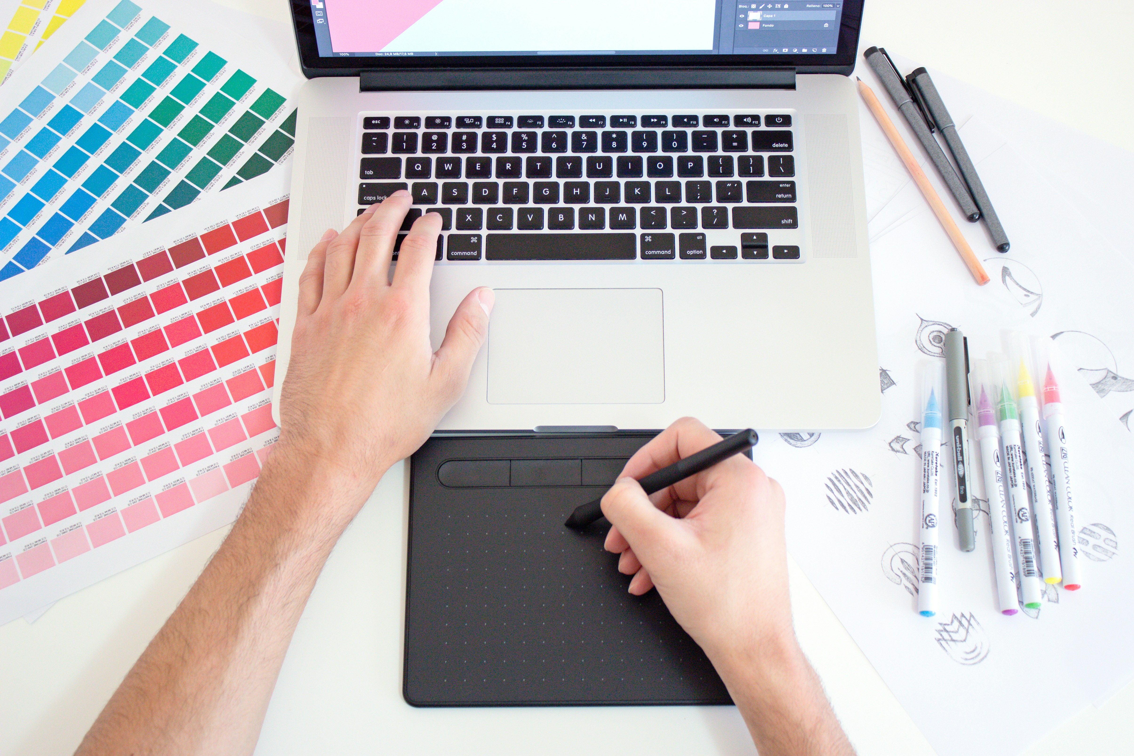
1/ Wireframing and prototyping tools
The holy trinity of interaction design tools:
- Adobe XD: The Swiss Army knife approach does everything reasonably well.
- Sketch: Like the reliable Honda Civic of design tools, not the flashiest, but gets the job done.
- Figma: The cool kid everyone's talking about. Real-time collaboration makes it feel like Google Docs for designers.
Wireframing is like sketching before painting; it saves you from expensive mistakes later.
Pro tip: Start with paper sketches before jumping into digital tools. Your brain works differently with a pen in hand.
2/ Usability testing tools
Because what you think works and what actually works are often two different things:
- Morae: The heavy-duty option for when you need serious data.
- Lyssna: Quick testing that doesn't require a PhD in research methods.
- Lookback: Watch users struggle in real-time. It's painful but necessary.
Usability testing is like taste-testing your cooking—you might think it's perfect, but other people's reactions tell the real story.
Pro tip: Test with 5 users, fix the obvious problems, then test with 5 more. Repeat until you stop finding major issues.
3/ Collaboration tools
Design isn't a solo sport. It's more like a relay race where everyone has sweaty palms and the baton is a Figma file.
These tools keep your team in sync, your ideas flowing, and your devs from slacking:
- Slack: Where work happens, and where 80% of your design debates will live (with gifs, of course).
- Miro: The digital whiteboard where sticky notes multiply like rabbits. Perfect for brainstorming, mapping, and controlled chaos.
- Zeplin: Your peace treaty between designers and developers. Specs, assets, and handoffs, all in one place without passive-aggressive emails.
Collaboration tools aren’t just about talking, they’re about aligning. Fast.
Pro tip: Don’t just pick a tool, set team rituals around it. Use Miro for weekly idea dumps, Slack for async check-ins, and Zeplin for every handoff. Tools only work when you build habits around them.
Case Studies: learning from the masters
Let's see how the pros do it:
1/ Airbnb: Redefining user interactions
Airbnb turned "staying in a stranger's house" from terrifying to delightful through masterful interaction design. Their booking flow feels more like planning a vacation than filling out insurance forms.
The genius? They removed friction without removing information. Dates are visual, locations are mapped, and every step feels like progress toward something exciting.

2/ Slack: Balancing complexity and simplicity
Slack solved the impossible problem: making work communication not suck. They hid complexity behind simplicity, new users see a clean chat interface, while power users discover layers of functionality.
Their notification system is particularly brilliant. It's assertive enough to be useful but respectful enough not to be annoying. That's a tightrope walk most apps fall off.

3/ Spotify: Personalization and user engagement
Spotify doesn't just play music, it creates musical moments. Discover Weekly feels like getting a mixtape from a friend who really knows your taste.
Their interaction design makes discovery feel serendipitous rather than algorithmic. That's the difference between "here's what you might like" and "here's what you'll love."

Crafting your wwn IxD masterpiece: The process
Ready to create your own interaction design magic? Here's your step-by-step recipe:

1/ Research and ideation
Before you move pixels, move minds. Great UX starts with user research—aka, figuring out what your users actually want instead of guessing (or worse, assuming you’re the user).
Build personas that aren’t just names with stock photos, but real reflections of user behaviors and pain points. Interviews, surveys, even stalking user behavior (ethically!) can reveal insights that make or break your design.
Pro tip: Shadow real users for a day. Watch how they currently solve the problem your product addresses. Their workarounds are your feature opportunities.
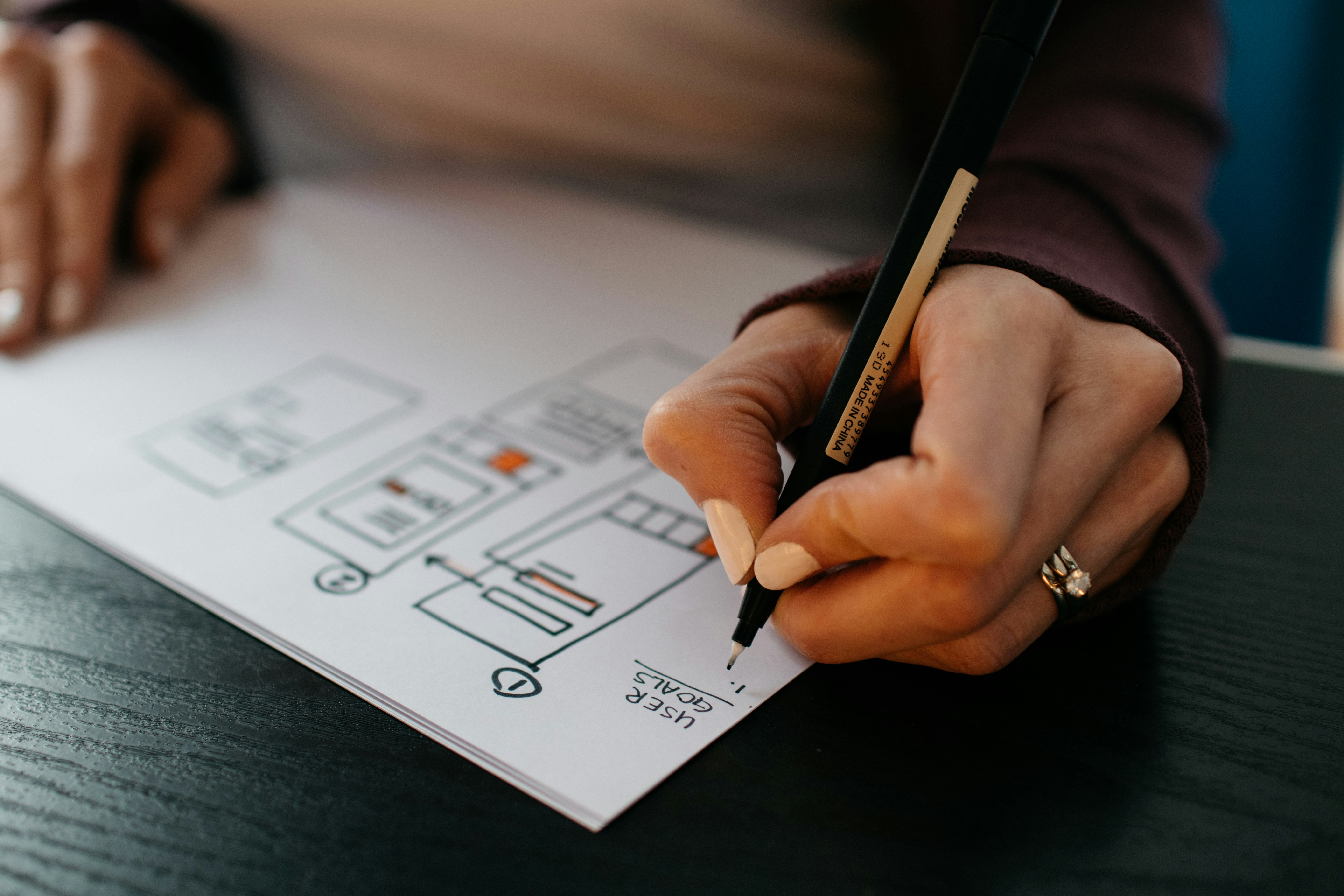
2/ Sketching and wireframing
Time to put pen to paper, literally. Sketch your ideas like you're storyboarding a movie, not building IKEA furniture. Explore structure and flow without sweating over button gradients just yet.
Wireframes are like blueprints for a house: no one’s moving in yet, but you’d better know where the kitchen goes. Iterate fast, fail faster.
Pro tip: Set a timer for 10 minutes and sketch 8 different approaches to the same problem. Your first idea is rarely your best idea.
3/ Prototyping
Now bring those static sketches to life. Interactive prototypes are where your design starts walking and talking. Want to find holes in your logic? Let users click things.
Use tools like Adobe XD to create clickable journeys that feel real enough for testing but fake enough to change tomorrow.
Pro tip: Prototype the hardest part first. If you can't make the complex interaction work, the simple ones won't save you.
4/ Testing and refinement
Usability testing is your design’s “tell me the truth” moment. Watch real people interact with your work, and try not to cry when they get stuck on step 1.
This isn’t one-and-done. Keep testing, keep tweaking. Feedback is gold, even when it stings.
Pro tip: Ask users to think aloud, but don't ask leading questions. "What are you thinking?" is better than "Is this confusing?”
5/ Development and integration
Now hand it over to your favorite developer (or yourself, if you’re that powerful). But don’t disappear, stick around to make sure your pixel-perfect prototype doesn’t turn into Frankenstein’s monster.
Tools like Zeplin help translate your vision into dev-friendly language, saving everyone from “Wait, was this button supposed to animate?”
Pro tip: Sit with developers during implementation. Many interaction details get lost in translation, being there prevents miscommunication.
6/ Post-launch evaluation
Launch isn’t the end, it’s halftime. Keep an eye on how real users behave now that the training wheels are off.
Analytics tools like Google Analytics or Hotjar reveal what people actually do, not just what they said they’d do. Iterate, improve, repeat.
Pro tip: Set up funnel analysis to see where users drop off. Those drop-off points are your interaction design homework assignments.
👉 How to Improve Interaction Design in Your Projects:

The future of Interaction Design
The future is coming whether we're ready or not. Interaction design is evolving beyond screens into voice, gesture, and probably brain-computer interfaces (though let's hope we get the privacy settings right on that last one).
AR, VR, AI…these aren't just buzzwords anymore. They're platforms that need interaction design thinking. The principles stay the same, but the canvas keeps expanding.
Voice interfaces are particularly interesting. How do you design for an interaction that has no visual component? It's like being a radio DJ for robots.
Pro tip: Start experimenting with voice interface design now. Alexa Skills and Google Actions are good training grounds for post-screen interaction design.
What every UX designer needs to remember
Mastering Interaction Design is like learning to speak fluent “user”, with just the right mix of psychology, pixels, and wizardry. It’s not just buttons and screens. It’s crafting experiences that feel intuitive, human, and maybe even a little magical.
For UX designers, it’s a lifelong dance of testing, tweaking, and asking, “But will this make sense at 2 am to a sleep-deprived user?”
So here’s to designing interfaces that don’t just work. They delight.
Let’s go build something people actually enjoy using 🍀
Whenever you're ready, there are 4 ways I can help you:
1. Junior Designer Bundle: Transition into UX and craft an unforgettable portfolio & get hired.
2. Senior Designer Bundle: Become a design leader with systems to build healthier, happier teams.
3. UX Portfolio Critique: In less than 48 hours, get your 30-minute personalised video of brutally honest feedback.
4. Job Sprint Course: Stand out in an unpredictable job market by building a memorable personal brand and a killer job search strategy.