Table of Contents
- UX Laws are…overrated
- #1 The Law of Clarity: The Secret to User Satisfaction
- #2 The Law of Feedback: Keep Users Engaged and Informed
- #3 The Law of Consistency: Creating a Seamless Experience
- #4 The Law of Flexibility: Catering to Diverse User Needs
- #5 The Law of Proximity: Increase Efficiency through Strategic Grouping
- #6 The Law of Error Prevention: Reduce Frustration by Minimizing Mistakes
- #7 The Law of Affordances: Communicate Function with Visual Cues
- #8 The Law of Recognition: Make Your Interface Intuitive
- #9 The Law of Cognitive Load: Simplify Tasks for Enhanced Usability
- #10 The Law of Emotional Design: Evoke Positive Emotions for Memorable Experiences
- Key takeaways
Do not index
Read time: under 4 minutes
UX Laws are…overrated
UX laws seem to be all the rage on Google Search these days.
As someone who has spent over a decade working in UX design, I’ve realized not all of them are as practical and applicable as they might seem.
In today’s blog post, I’ll share my personal top 10 UX laws that have truly made a difference in my day-to-day design work
These laws have stood the test of time and consistently delivered results in creating exceptional UX.
So, without further ado, let's dive in 👇
Questions you should ask when designing with Emily Anderson.

#1 The Law of Clarity: The Secret to User Satisfaction
The best UX designs prioritize clarity and simplicity. Ensuring users can easily navigate and understand your platform.
If users ever have to stop and think, clarity is missing. Ask yourself:
- Can they complete their goal without guessing?
- Does the user instantly understand what to do here?
- Is this interaction obvious, or does it need explanation?
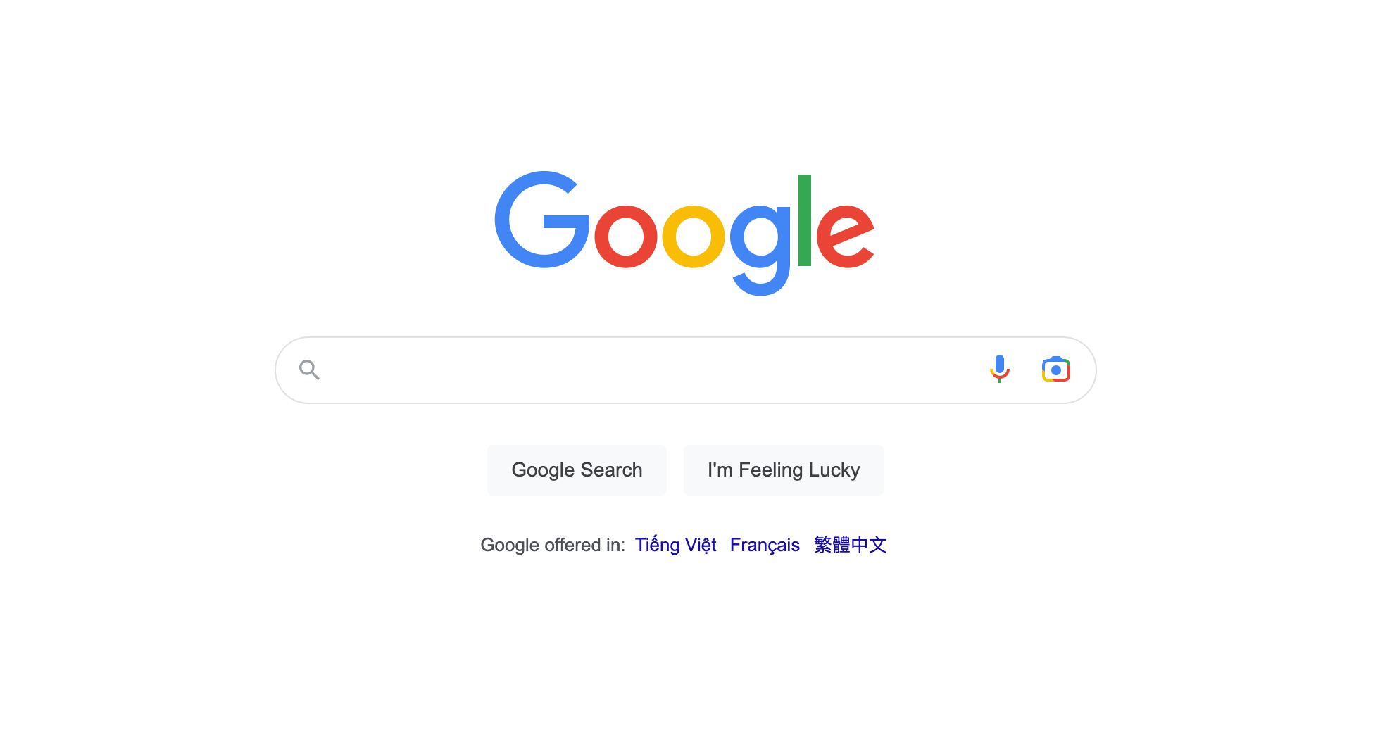
Example: Google's search page exemplifies this principle with its minimalistic layout and straightforward search function.
Clarity reduces cognitive load by cutting down choices, using plain language, and showing only what’s needed, when it’s needed. Clarity works across 3 levels:
✅ Textual clarity. Use words your users already know. Avoid jargon. Labels like “Sign in,” “Track Order,” or “Upload File” are short, expected, and crystal clear.
✅ Visual clarity. Think hierarchy. Use whitespace to group things logically. Make CTAs stand out. Don’t let 5 fonts fight for attention.
✅ Functional clarity. Set the right expectations. When a button says “Continue,” users should know where they’re going. No tricks, no surprises.
Pro tip: Clear interfaces are usually silent ones. If you have to explain how to use it, the design isn’t finished yet.
#2 The Law of Feedback: Keep Users Engaged and Informed
Design isn’t a monologue, it’s a conversation between user and interface. And feedback is how the system shows it’s listening. Ask yourself:
- Is the feedback relevant, or just decorative?
- Does every user action get a timely response?
- When something goes wrong, does the UI help or hide?
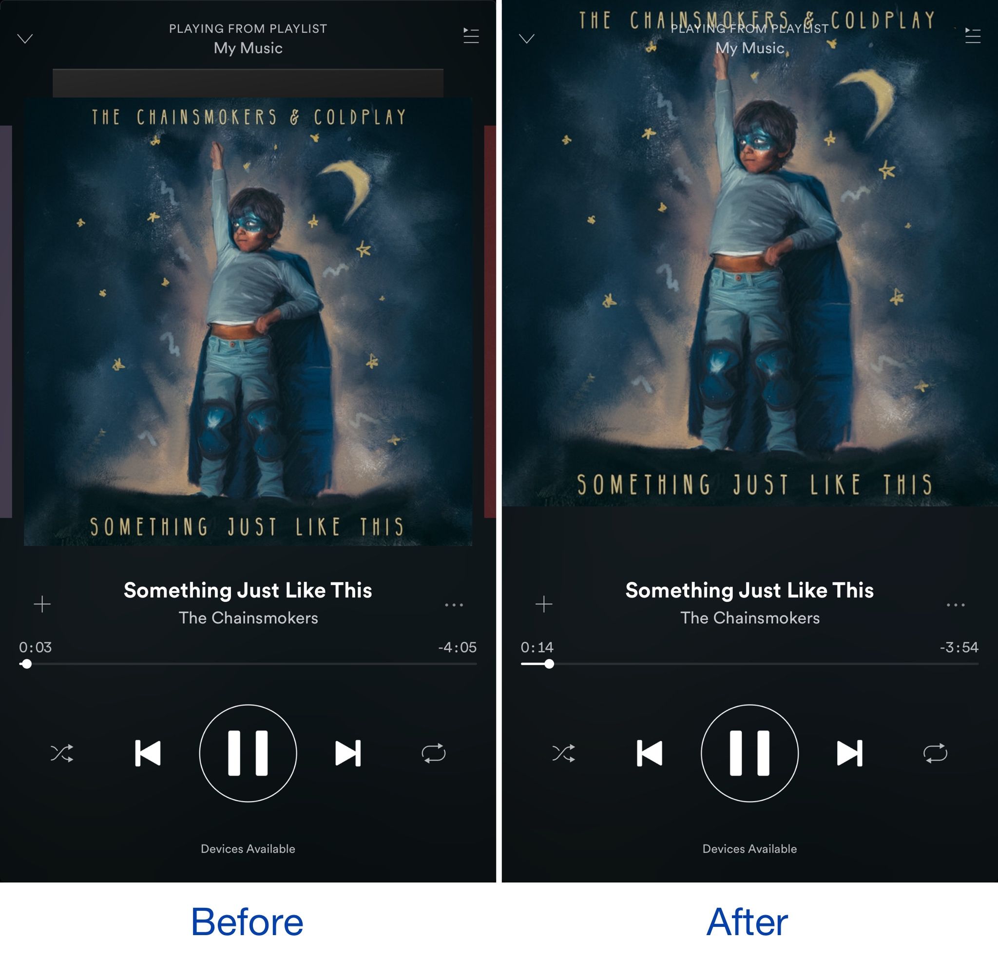
Example: Instagram's "like" feature provides immediate feedback by turning the heart icon red and displaying the number of likes when tapped.
Good feedback is immediate, visible, and informative, not just decorative confetti. Feedback works across 3 levels:
✅ Positive feedback. Reinforce correct actions with animations, sounds, or state changes. Even a small bounce or glow can make actions feel acknowledged.
✅ Negative feedback. When something fails, show why, and how to fix it. Avoid vague errors like “Something went wrong.”
✅ Passive vs active feedback. Hover states, progress bars, haptic taps — all these provide subtle cues that confirm the interface is responsive.
Pro tip: “No feedback” is feedback and it usually feels like something’s broken. Design for silence, but always speak when it matters.
#3 The Law of Consistency: Creating a Seamless Experience
Users expect consistency within a platform, both visually and functionally.
Consistent design elements, like colour schemes and button styles, promote a seamless experience and help users build familiarity with your product. Ask yourself:
- Do similar components behave the same way?
- Would a user ever be surprised by this screen?
- Does this pattern match what we’ve used elsewhere?
Example: Apple's iOS maintains a consistent design language across its apps, making it easy for users to navigate and understand different functionalities.
Consistency helps users build mental models, reduces decision fatigue and makes navigation effortless. It shows up across 3 layers:
✅ Visual consistency. Use the same font, colors, spacing, and alignment across all screens. Let design systems do the heavy lifting.
✅ Behavioral consistency. Buttons should behave the same across contexts. Navigations shouldn’t flip logic between screens.
✅ Language consistency. Call it “Checkout” or “Place Order” — just not both. Pick one and stick to it.
Pro tip: Consistency compounds. The more consistent your UI, the less your user has to learn, and the more intuitive your product becomes.
#4 The Law of Flexibility: Catering to Diverse User Needs
Different users have different preferences, needs, and abilities.
Your design should accommodate these variations by offering multiple ways to accomplish a task or providing customizable options. Ask yourself:
- Can users complete this task in more than one way?
- Does the product work well for people with different abilities?
- Can the UI adapt to different screens, contexts, or preferences?
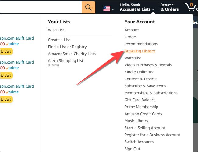
Example: Amazon offers multiple methods for users to browse and search for products, catering to diverse preferences and needs.
Flexibility isn’t about endless options. It’s about offering enough control to match diverse user needs. It shows up in 3 core ways:
✅ Responsive design. Your interface should scale across devices — from a mobile screen to a desktop monitor.
✅ User preferences. Let users tweak layout, theme, or language. Spotify’s custom playlists or Duolingo’s daily goal setting are great examples.
✅ Accessibility support. Include features like adjustable font sizes, color contrast, voice input, or keyboard navigation.
Pro tip: Flexibility isn’t feature bloat. It’s intentional adaptability. Start with defaults that work for most — then let power users go deeper.
More actionable tips and fewer headaches:
Join designers from 90+ countries using UX Playbook. Get detailed step-by-step guides and templates to supercharge your UX process.


#5 The Law of Proximity: Increase Efficiency through Strategic Grouping
The human brain groups what’s close together. If you break that instinct, you break comprehension. Ask yourself:
- Is the grouping logical and easy to scan?
- Is this layout guiding attention — or scattering it?
- Are related elements physically close on the screen?
Example: Spotify groups related controls, such as play, pause, and skip buttons, together, making it easy for users to control their music.
Proximity reduces scan time, improves comprehension, and helps users act faster. It plays out in 3 practical ways:
✅ Logical grouping. Place form labels next to their fields. Put icons close to their actions. Use card layouts to cluster similar content.
✅ Whitespace as a tool. Don’t cram everything together. Whitespace isn’t empty — it creates relationships between elements.
✅ Content hierarchy. Group content by topic, priority, or user flow. Avoid mixing calls-to-action with passive content.
Pro tip: If a user has to search for something that’s right in front of them, proximity failed. Organize by meaning, not just by alignment.
#6 The Law of Error Prevention: Reduce Frustration by Minimizing Mistakes
It's better to prevent errors from occurring than to correct them afterward.
Design your interface to minimize the likelihood of user mistakes by providing helpful instructions, warnings, and constraints. Ask yourself:
- What common mistakes could a user make here?
- Does the UI gently guide users away from failure?
- Are we preventing issues before they happen, or just handling them after?
Example: When creating a password, many websites display requirements and provide feedback on password strength, reducing the chance of users creating weak passwords.
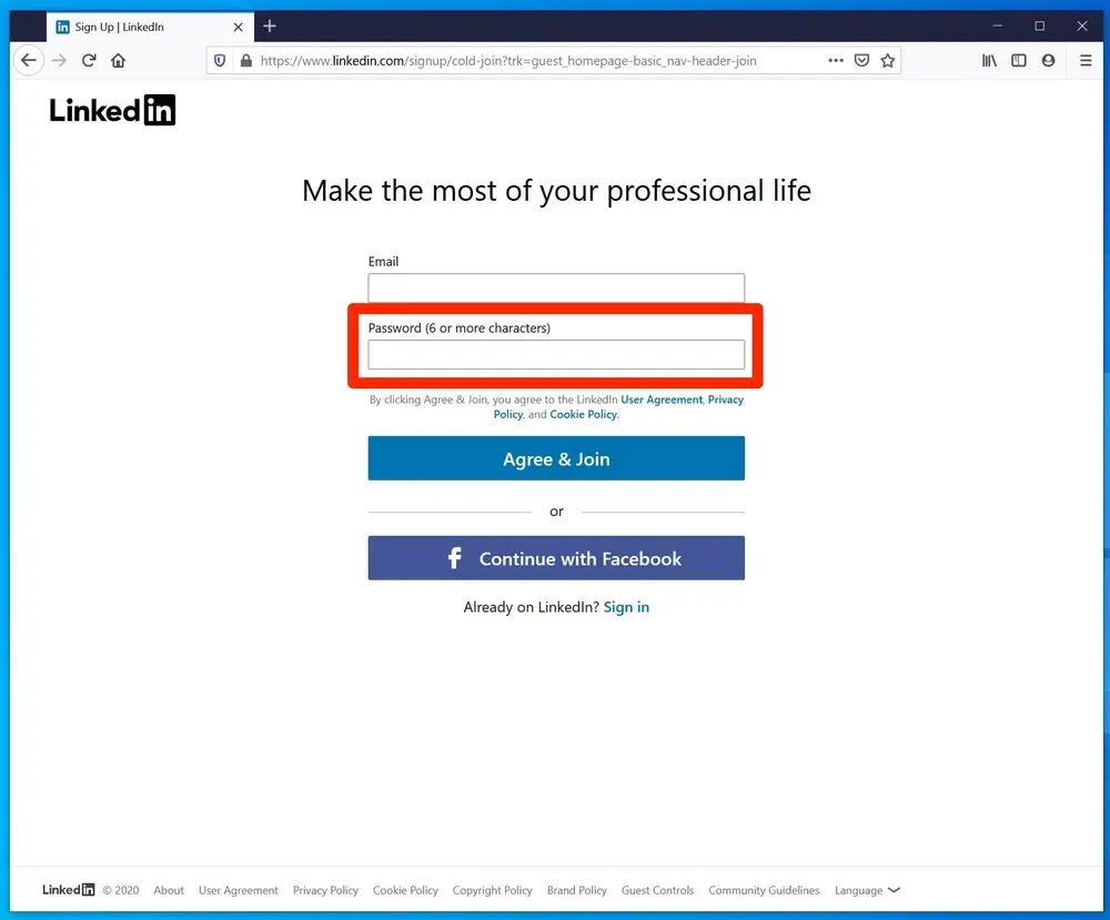
Error prevention is about foresight, not blame. It works through 3 design patterns:
✅ Constraints and defaults: Disable “Submit” until required fields are filled. Pre-fill known values. Offer safe defaults.
✅ Input validation: Check errors in real-time (not after submission). Tell users exactly what went wrong and how to fix it.
✅ Confirmations for high-stakes actions: A quick “Are you sure?” before deleting data can prevent major pain.
Pro tip: A helpful error message is good UX. But needing fewer error messages? That’s even better UX.
#7 The Law of Affordances: Communicate Function with Visual Cues
If your design has to come with instructions, it’s not intuitive. Affordance is how the UI tells users what’s clickable, draggable, tappable — without saying a word. Ask yourself:
- Does this element visually suggest what it does?
- Would a user instinctively know how to interact with it?
- Could someone new figure it out with zero explanation?
Example: Buttons are designed to look clickable, with raised edges and hover effects, signalling to users that they can be interacted with.
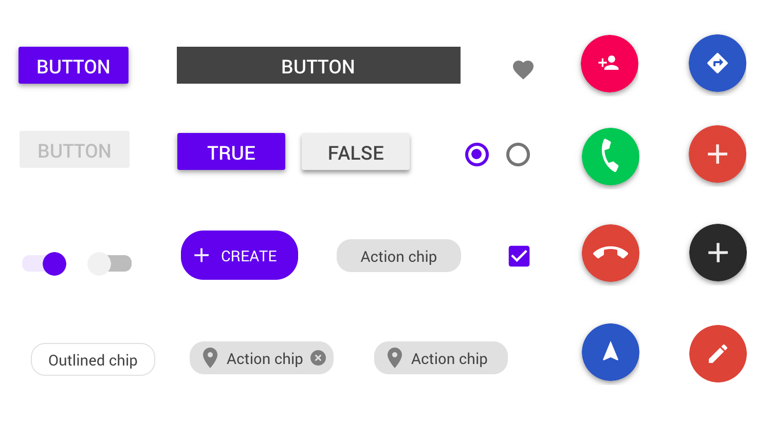
Affordances speak through design, not documentation. They show up in 3 key ways:
✅ Visual signals. Raised buttons look pressable. Hover states hint at interactivity. Arrows imply movement.
✅ Functional hints. Drag-and-drop areas that highlight when hovered. Checkboxes that animate on click.
✅ Preventing misuse. Doors with push plates discourage pulling. Similarly, greyed-out buttons imply “not yet.”
Pro tip: If you’re writing a tooltip to explain a button’s purpose, pause. Ask yourself: could the design explain it better?
#8 The Law of Recognition: Make Your Interface Intuitive
People don’t want to memorize how your product works. Recognition is easier, faster, and far more forgiving than recall. Ask yourself:
- Are we reusing familiar icons, layouts, and patterns?
- Are we overcomplicating something that already has a universal symbol?
- Do users need to remember what that button does — or can they recognize it?
Example: The hamburger menu, composed of three horizontal lines, is a widely recognized symbol for a navigation menu.
Recognition creates familiarity and speeds up onboarding. It shines in 3 areas:
✅ Familiar icons. Use standard symbols like the hamburger menu, search magnifying glass, trash bin for delete.
✅ Repetition of patterns. Use consistent layouts across pages. Users shouldn’t have to relearn navigation on every screen.
✅ Minimal memorization. Let the system handle memory — pre-fill fields, auto-suggest entries, and maintain search history.
Pro tip: When in doubt, steal from the web’s greatest hits. Familiar beats clever when it comes to UX.
#9 The Law of Cognitive Load: Simplify Tasks for Enhanced Usability
The more users have to think, the more likely they’ll quit. Cognitive load is the silent killer of good UX. Ask yourself:
- Could this step be simpler — or split in two?
- Are we giving users one clear task at a time?
- Is any of this info unnecessary or redundant?
Example: Airbnb's booking process breaks down the reservation into manageable steps, guiding users through the process without overwhelming them with information.
Simplifying doesn’t mean dumbing down, it means removing noise so the signal comes through. Here’s how to lighten the load:
✅ Progressive disclosure. Show advanced options only when needed. Let beginners succeed, then invite depth.
✅ Smart chunking. Break forms, tasks, and flows into bite-size steps. Let users complete goals step-by-step, not all at once.
✅ Strong visual hierarchy. Guide the eye with clear headings, contrast, and groupings. Use layout to direct attention — not distract it.
Pro tip: If your screen feels like a buffet of buttons, it’s time to slim down. Simpler UI = sharper thinking.
#10 The Law of Emotional Design: Evoke Positive Emotions for Memorable Experiences
Great design works. But unforgettable design feels something. Emotion shapes how users remember, and whether they return. Ask yourself:
- Does this moment feel human or mechanical?
- Does our product show empathy in stressful moments?
- Are we using tone, animation, or visuals to spark emotion?
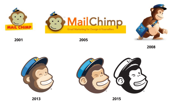
Example: MailChimp's mascot, Freddie, adds a touch of fun and personality to the platform, evoking positive emotions and making the experience more enjoyable for users.
Emotion lives at every layer, not just cute illustrations. It can take the form of:
✅ Delightful micro-interactions. Subtle animations on “like,” “add to cart,” or “send” build joy and rhythm into the interface.
✅ Tone of voice. Write like a human. Friendly microcopy, thoughtful error messages, and positive reinforcement make users feel seen.
✅ Design for moments. Celebrate completed tasks. Offer support after errors. Inject joy where users expect nothing.
Pro tip: Emotion isn’t decoration, it’s persuasion. A design that feels good gets used more often.
Key takeaways
As you step into the world of UX design, remember that UX is all about making genuine connections with your users and enhancing their digital journeys.
The 10 UX laws shared here have shaped my design career and helped me create experiences that truly resonate with people.
So, embrace these game-changing UX laws, unleash your creativity, and embark on a journey to transform the digital world, one exceptional UX at a time.
Happy designing! See you in the next blog post ✌️
Whenever you're ready, there are 4 ways I can help you:
1. Junior Designer Bundle: Transition to UX with the ultimate handbook (120+ videos, 80+ templates, 75+ examples) to craft an unforgettable portfolio & get hired.
2. Senior Designer Bundle: Become a design leader with systems to help you build a meaningful career & grow your designers. Join 500+ aspiring leaders.
3. UX Portfolio Critique: Get a 30-minute video review of your portfolio. A checklist of actionable things to fix, in less than 48 hours. Get a personalised portfolio critique here.
4. Job Sprint Course: Get battle-proven frameworks and interactive workshops to: build a memorable personal brand, a killer strategy for job applications, and tactics to nail job interviews. Get hired in UX with Job Sprint.